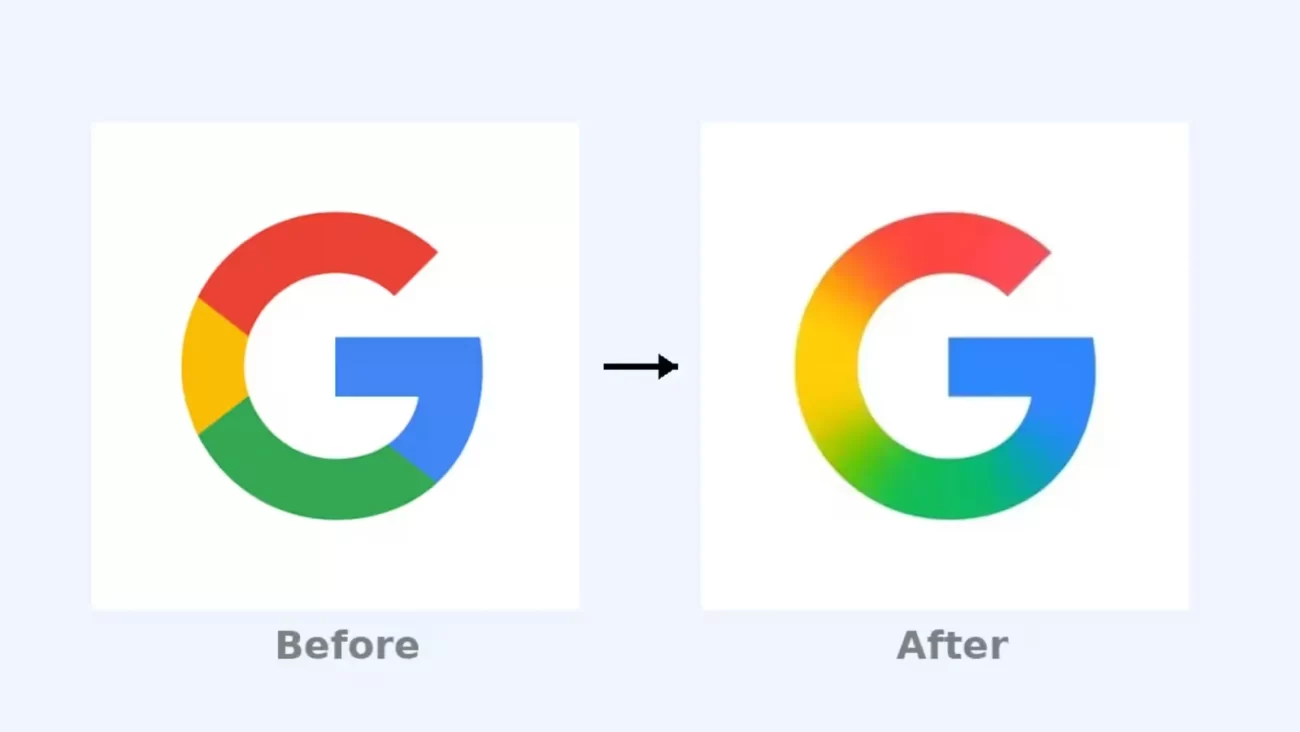
After 10 Years, Google’s Iconic ‘G’ Logo Gets a Stunning Gradient Makeover on May 12, 2025

Overview: Ten Years of Changing Visual Identity
Google debuted its first significant redesign of the recognizable “G” logo in almost a decade on May 12, 2025. In this update, a vivid, flowing gradient that effortlessly combines the hues red, yellow, green, and blue takes the place of the former solid color blocks. Google’s ‘G’ Logo Makeover, the makeover heralds a new era of innovation and a unified product identity by reflecting Google’s transition to an AI-driven future and complementing the design of its Gemini AI assistant branding.
Why Did Google Change Its Logo?
In order to integrate its AI-powered solutions under a single, unified brand, Google is redesigning its logo in 2025 as part of a larger visual overhaul.The gradient represents motion, fluidity, and adaptability—three essential components of Google’s AI-first approach. Google embraces depth and modernity by eschewing flat style, which makes the logo more dynamic and adaptable to the current digital environment.
What’s New in the Gradient ‘G’ Logo?
Smooth Color Transitions: The new logo employs a fluid, aurora-like appearance that adds vitality and depth by blending red into yellow, yellow into green, and green into blue in place of four separate solid colors.
Retained Typeface: The 2015-introduced Product Sans font hasn’t altered, maintaining brand identification while updating its appearance.
Digital Optimization: In keeping with Google’s multi-platform presence, the gradient improves visibility and appeal on high-resolution devices, including computers and smartphones.
Conformity to Gemini Branding: The gradient highlights Google’s integrated AI ecosystem by reflecting the blue-to-purple gradient of the Gemini AI logo.
Public and Designer Reactions
The updated logo has generated a lot of conversation. Designers commend the gradient’s subtle refinement and its cleaner, more contemporary look.
Users’ opinions vary; some like the new design, while others long for the solid colors’ simplicity.
The cultural effect of the emblem is shown in the vibrant debate and memes that have been produced by online communities.
Historical Context: Google Logo Evolution
Serif font with whimsical colors and shadows, 1998–2010.
2010–2015: Subtle shadows were eliminated and the design was flattened and brightened.
Product Sans and the solid multicolored “G” emblem were introduced between 2015 and 2025.
From 2025 to the present, the gradient “G” emblem represents design trends and AI-driven innovation.
What About Other Google Product Logos?
The gradient style has not yet been included into the primary six-letter Google wordmark or other app icons, such as Gmail, Chrome, or Maps. Nonetheless, experts predict that gradient aspects might soon be added to these items given Google’s focus on AI and consistent branding.
Easter Egg and User Experience
As is customary with Google, if you search for “Google logo 2025” or click on the logo on the homepage, a vibrant animation will play that shows the old logo changing into the new gradient design. Alongside its cosmetic changes, this amusing feature demonstrates Google’s dedication to providing interesting user experiences.
Conclusion: A Bold Step into the AI Era
Google’s May 12, 2025, gradient “G” logo upgrade is more than just a style change. It represents ten years of expansion, a dedication to creativity, and a single, AI-powered future. This little but significant update puts Google at the forefront of contemporary branding by fusing traditional elements with innovative design.
For Businesses Looking to Stay Ahead
Visit Easynet Digital, the top Digital marketing agency trivandrum, to maintain your brand’s vibrancy and competitiveness in the digital era. Their knowledgeable staff provides customized digital marketing solutions that will make your company stand out as much as Google’s new logo.
DR. Girish Krishnan
Director & Strategy Consultant.
Recent Posts
READY TO GROW YOUR BUSINESS?
Contact us to develop STRATEGIES FOR SUCCESS for your business growth.


